Not Just Words
Context
Not Just Words is an advertising and communication company based in Edinburgh, specialised in languages — translating, editing, writing, and web design — with a focus on cross-cultural Spanish–English services.
Brief
Design the corporate identity and the new website, presenting the process from early wireframes through visual identity to high-fidelity screens.
Brand system
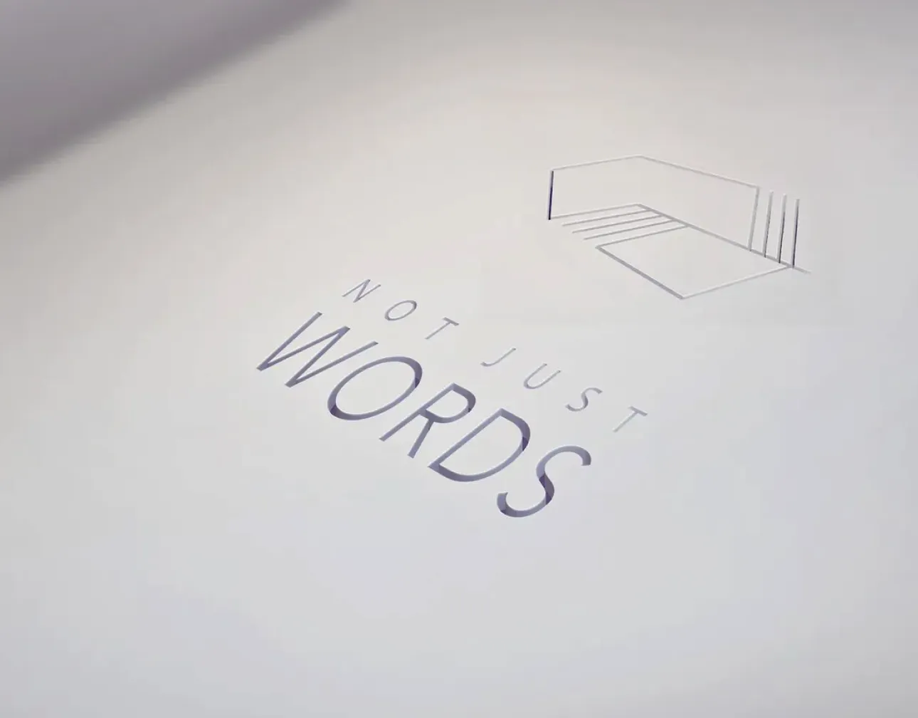
A geometric feather / folder mark sits with the wordmark NOT JUST / WORDS. Type pair: Helvetica and Gill Sans. Palette: pink #E787A3, turquoise #58D0BC, and white — used as accents on clean black-and-white layouts and soft geometric patterns.
Applications include debossed mark treatments and business cards clipped in a simple studio mockup.
Website
Low-fidelity wireframes (sketched, then digital) defined structure for home, about, services, expertise, portfolio, contact, and blog. High-fidelity UI carries:
- A Chomsky quote framed as “a language is not just words”
- Service pillars: translation, content writing, editing & proofreading
- Fields of expertise and a filtered portfolio grid
- Contact and pricing paths for quote requests
Outcome
Deliverables: logo and stationery, identity guidelines (type + colour), wireframes, and a full website design for a language-services brand.