
Hermes International
Most people came here for one thing.
Hermes International sells freight, parcel, customs clearance, supply chain data and APIs. The person who actually arrives at the site usually wants to know where one box is.
The design problem is holding both of those true at once. Give the business customer the depth they came for, and still let someone with a tracking number finish in four seconds.
01: Design one front door for two different people.
Two audiences with almost nothing in common.
The recipient has a tracking number, no account, no patience and no interest in the company. The business customer has contracts, credentials, a portal they log into weekly and a reason to care how the whole thing works.
A site that serves one usually fails the other. The recipient gets buried under enterprise navigation, or the business customer lands on a consumer page and cannot find their portal. The answer was not two sites. It was giving each one its own real estate on the same page: the recipient owns the hero, the business customer owns everything below it.
02: Make the tracking field impossible to miss.
The tracking panel sits in its own blue field, with the container terminal photography cut away behind a curve so the two halves read as one composition instead of a banner with a box on it.
It is the only input on the page. One field, one submit, and two escape hatches underneath for the people the simple path does not cover: Advanced Tracking for those who need more, Need help? for those who are stuck. No account, no step before it, nothing to dismiss.
03: Split self-service from platform.
Our Services holds five things that look like one row of equals and are not.
Reporting, Parcel ePortal and Dev Portal are places you log into. You already know what they are. SCM Platform and World Parcel Service are products that have to be explained and sold.
So they are weighted differently. The three portals sit on white with a quiet text link. The two products sit on a grey band with a filled orange button, the only saturated colour on the page after the hero. Same grid, different pressure. A returning customer scans the top row and leaves. A prospect gets pulled into the bottom one.
04: Let one illustration carry the supply chain.
The SCM band had to say air, road and sea, across borders, in one view without a paragraph. A globe with a plane leaving it, a truck crossing it and a container ship at the waterline does that in a glance.
It also does something a photograph cannot. It spans the full band and bleeds off the left edge, which anchors the two product cards instead of leaving them floating on grey.
05: Build the system before the pages multiply.
The site was never going to be one page. Portals, a status page, an FAQ, a blog, and whatever came next.
So the deliverable was not a set of screens. It was the system underneath them: the colour and type scale, the spacing rules, the component library, the icon library, and how it was handed to engineering.
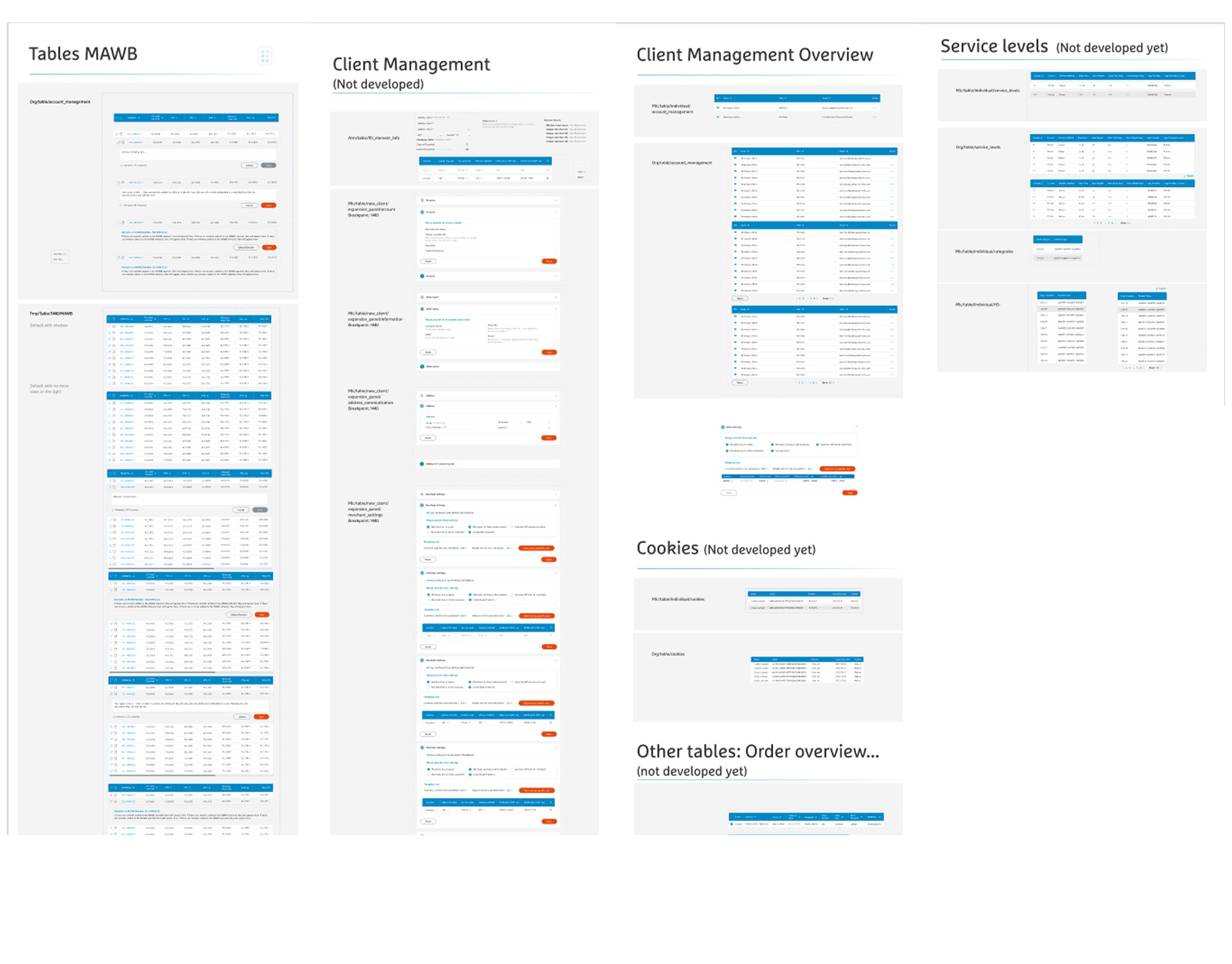
TO ADD: what existed before, what you inherited from the Hermes parent brand, and what you had to define yourself.
06: Show customers what is broken.
Most logistics platforms handle an outage by going quiet. The IT Service Health Status page does the opposite. It publishes the ticket.
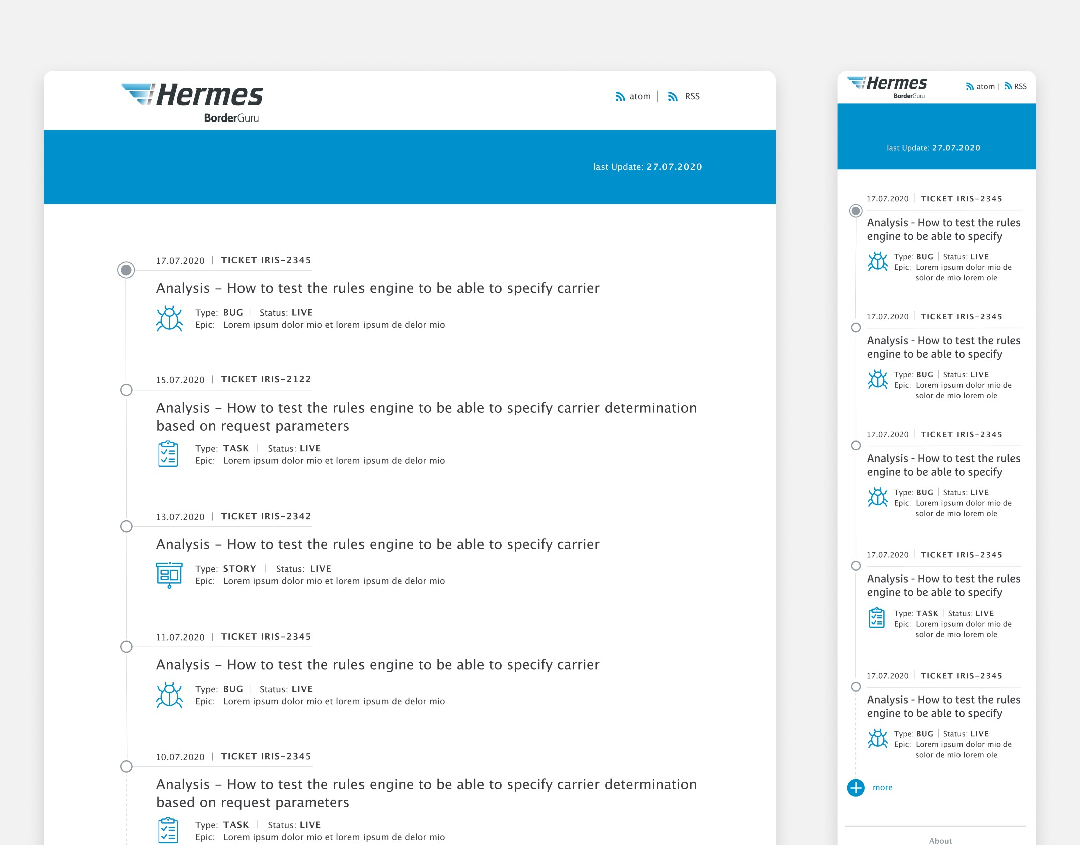
Every entry carries a date, a ticket ID, a title written as a sentence, the type, the status and the epic it belongs to. A customer whose integration stopped working overnight can see whether it is known, what kind of problem it is, and whether the fix is live, without opening a support case.
07: Let the status page come to them.
Atom and RSS in the header, given the same weight as the page title.
Nobody checks a status page on a good day. The feed means an integration team learns about an incident inside the tool they already have open, which is the only version of this that actually works.
08: Rebuild the timeline for a thumb.
The desktop timeline has a wide column, so the icon, the type, the status and the epic can sit beside each other and still breathe.
On a phone that collapses. The mobile version keeps the two things that make it read as a sequence, the vertical line and the node markers, and drops everything that was only decoration. The title truncates to two lines, type and status share one row, the epic wraps under its own label, and the footer stacks into three centred blocks.
09: Move one element three times until it stops being a guess.
The mobile FAQ had a category selector and a set of pagination dots, and no obvious place for either.
Three variants. Dots under the hero with the selector below it. Dots under the selector. Dots under a taller selector row with more breathing space above the first question.
It looks like a small thing. It decides whether a first-time visitor understands that the FAQ has categories at all, or scrolls one long list and gives up.
TO ADD: which one won, and what made the difference.
The parcel is the product.
Hermes International sells freight, customs clearance and APIs. None of that is what the person at the other end is thinking about.
The job was to keep that person four seconds away from an answer, and to let everyone else have the depth they came for, further down the page.