Isle of Arran
Context
Isle of Arran is a gender-neutral cosmetics concept for products made with mineral and organic ingredients from Scotland’s Isle of Arran — quality beyond gender stereotypes, certified to high organic standards.
Brief
A corporate identity project covering:
- Naming a gender-equality and ecological cosmetics brand
- Logo, typography, and a binary geometric mark
- Product forms that echo the brand geometry
- Packaging in clean, ethereal whites
- Advertisement and shop applications
Brand idea
As gender roles open up, sexist beauty marketing fits younger audiences less well. Isle of Arran breaks that pattern with gender-neutral branding and products that do not split the shelf by “him” and “her.”
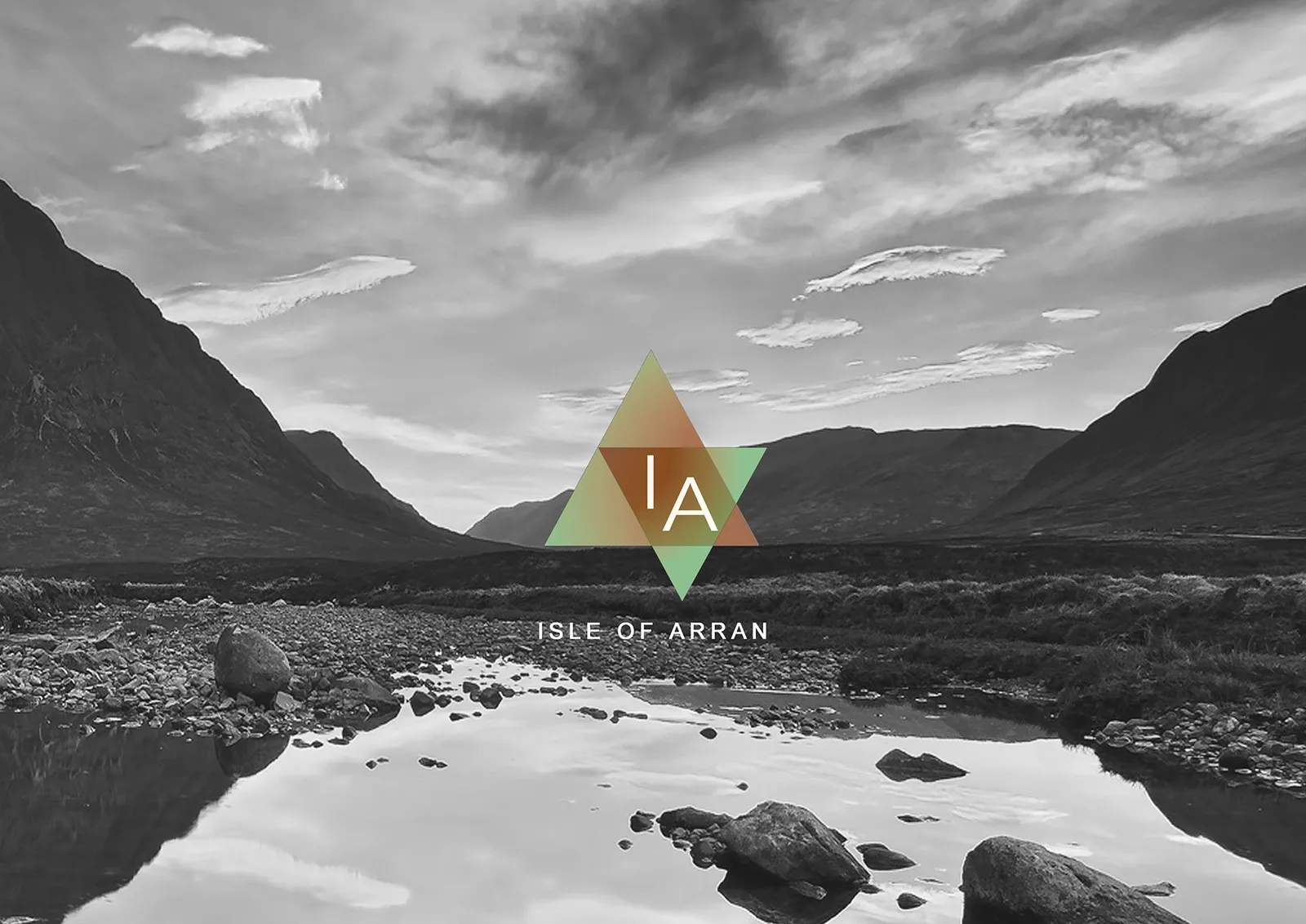
The mark uses two overlapping triangles — a clear geometric binary — with an IA monogram. Earthy greens, ochres, and terracotta sit against black-and-white landscape and fashion photography.
Product & packaging
Because the brand is agender, packaging follows the same geometry: triangular prism lip-colour balms and lipstick cases, plus a kit tin for mascara, lipstick, eye shadow, and cleanser. Surfaces stay white, black, silver, and accent colour — clean rather than gendered.
Applications
Identity carries into out-of-home ads (A new era of natural beauty), shop signage, and soft merchandise such as tote bags — so the mark reads as consistently off the shelf as on it.
Outcome
Deliverables: brand name direction, logo system, product and packaging design, and campaign / retail applications for a gender-neutral organic cosmetics line.